How Adaptive Interfaces Are Changing Apps and Websites

Adaptive interfaces are quietly reshaping the digital world—nudging, hiding, and adapting in real time. But what are they becoming?
The Rise of Adaptive Interfaces in Apps and Websites
Have you ever opened an app at night and noticed it quietly switched to dark mode, surfaced the one thing you usually tap, and hid the rest? It can feel a little like the screen is reading the room. That's the basic idea behind the rise of adaptive interfaces in apps and websites. These interfaces don't stay fixed. They shift based on your device, behavior, context, or accessibility needs. And once you notice it, you start seeing it everywhere.
What Are Adaptive Interfaces in Apps and Websites?
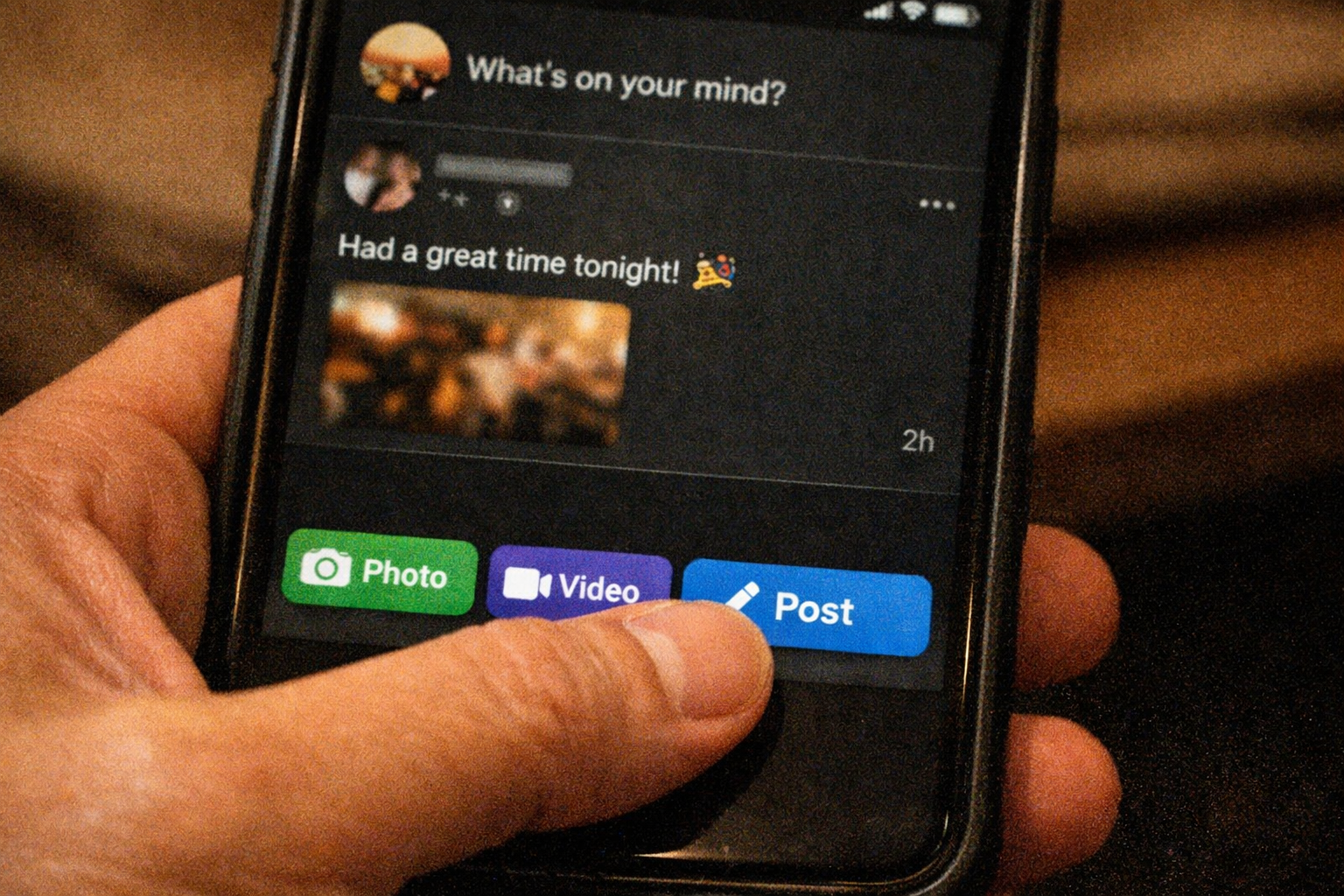
Adaptive interfaces are app and website interfaces that change based on user behavior, context, device, or accessibility needs to improve usability and relevance. In plain terms, the interface pays attention to useful signals and adjusts what you see or how you move through it.
That doesn't mean the whole product turns into something new every time you open it. Usually, the core stays stable. But parts of it can adapt, like navigation, layout density, shortcuts, text size support, or the order of content. The goal is simple. Make the experience feel easier, clearer, and more fitting for the moment.
This is a big reason behind the rise of adaptive interfaces in apps and websites. People now expect digital products to feel aware of screen size, context, and accessibility settings, not just display the same thing to everyone.
Adaptive vs. Responsive vs. Personalized UI
Here is the simplest way to separate the three:
| Type | What changes | Based on what | Example |
|---|---|---|---|
| Responsive UI | Layout | Screen size | A 3-column desktop layout becomes 1 column on mobile |
| Adaptive UI | Interface elements or structure | Device, behavior, time, accessibility settings, context | An app moves key actions to the bottom on mobile and simplifies menus at night |
| Personalized UI | Content or recommendations | User profile, history, interests | A shopping site recommends products based on past browsing |
Responsive design is mostly about fit. Personalized design is mostly about content. Adaptive design sits in the middle. It changes the interface itself based on signals that matter in the moment.
What makes an interface adaptive in practice
In practice, an adaptive interface can change things like:
- navigation placement
- content priority
- layout density
- color theme
- button size
- helper prompts
- motion levels for accessibility
So, if someone always checks order status first, that action might move closer to the top. If their phone has reduced motion turned on, animations may soften or disappear. If they're on a small screen with one hand free on a train, the app may surface bigger tap targets and fewer choices. Small shifts. Real impact.
Why Adaptive Interfaces Are Rising Now
A few forces came together at the right time. First, mobile became the main screen for huge parts of daily life. In many markets, mobile web traffic passed desktop during the mid-2010s. Since then, people have moved between phones, tablets, laptops, watches, and TVs without thinking twice. Fixed interfaces started to feel clumsy.
Second, AI and machine learning became more common in product design during the 2020s. Not magic. Just better systems for spotting patterns, like what people tap first, where they stop reading, or when they need help. That made adaptation more practical, even outside big tech companies.
Third, accessibility expectations are much higher now. And they should be. Users expect apps and websites to respect larger text settings, keyboard use, reduced motion, screen readers, and contrast needs. A static interface often struggles here.
Then there's plain old user expectation. People are used to smart recommendations, auto-fill, dark mode, and interfaces that seem to remember them. That's a major part of the rise of adaptive interfaces in apps and websites. Not because flashy change is trendy, but because relevance feels better than friction. You notice it most when it's missing.
How Adaptive Interfaces Decide What to Change
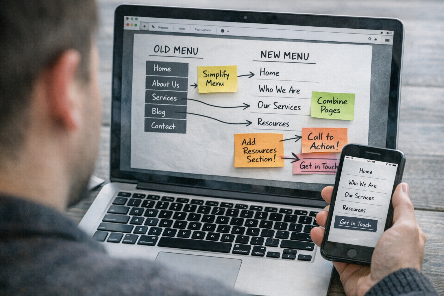
Adaptive interfaces work by reading signals, then applying small rules or patterns. Not every change needs AI. Often, it's simpler than that. If the screen is small, show fewer items. If a person always uses one feature, move it closer. If the system says reduced motion is on, cut animation.
The key is using signals that actually help the user. Not just collecting data because you can.
Signal sources and context inputs
Common signals include device type and screen size, which affect layout and tap targets. Location can matter too, especially for weather, local store hours, language, or delivery options. Time of day often drives theme changes or content timing. A meditation app at 11 p.m. shouldn't feel like a noon productivity dashboard.
Behavior matters a lot. Repeat actions, reading patterns, abandoned steps, and previous interactions can show what someone needs most. And OS-level settings are a big one, like larger text, high contrast, reduced motion, or screen reader support.
Wait, let me clarify. Good adaptive design doesn't need to spy on people. The best signals are often the most obvious and least invasive.
What changes based on those signals
Once those signals are in play, the interface can make practical adjustments. Navigation may become shorter on small screens. The most-used action might move to a thumb-friendly spot. Content may reorder itself so the useful part appears first.
It can also reduce visual complexity. Fewer banners. Less motion. Bigger text support. More spacing. Or a darker theme at night that feels easier on the eyes, like dimming a room before sleep.
The point isn't surprise. It's relief. You open the app and it feels ready.
Real-World Examples of Adaptive Interfaces
You can spot adaptive design in ordinary products, not just concept demos with chrome-looking buttons and sci-fi glow. A travel app might notice that mobile users usually care about boarding passes, delays, and gate changes first. So it pushes those actions to the top on travel day, while desktop users get broader trip planning tools.
A news site might adapt the reading experience based on device and time. On a phone during the morning commute, it can show short headlines and save-heavy images for later. At night on a tablet, it may switch to a calmer dark theme with larger text and more relaxed spacing.
E-commerce uses this too. If someone repeatedly filters by size and color, the site can keep those controls easy to reach. If the user has larger text enabled, product cards may simplify and stack cleanly instead of cramming details into tiny spaces.
And then there are accessibility-first changes. A website can reduce animation when the operating system asks for reduced motion. A finance app can surface recent actions first for returning users, but still keep core navigation stable so nothing feels lost. That's where adaptive design works best. Quiet, useful, almost invisible.
Benefits, Trade-Offs, and Limits

The upside is strong. Adaptive interfaces can make apps faster to use, easier to understand, and more comfortable on different devices or in different situations. They can improve engagement too, because people find what they need with less effort. For accessibility, the gains can be even bigger. Respecting text size, contrast, motion, and input preferences can turn a frustrating experience into a usable one.
But there are trade-offs. If an interface changes too often, people lose predictability. That's a real problem. You build muscle memory, then the button moves. Annoying. Sometimes worse than a static design.
Privacy is another concern. Context signals like location, past behavior, and device settings can be helpful, but they need clear limits. If users don't understand what is being tracked or why, trust drops fast. Brands feel that.
Implementation also gets more complex. Teams have to decide what should adapt, what should stay fixed, and how to test all those versions. A messy adaptive system can become harder to maintain than a simple one. So yes, the rise of adaptive interfaces in apps and websites makes sense, but only when the changes are useful, respectful, and easy to understand.
How Teams Can Implement Adaptive Design Without Confusion
The smartest approach is modest. Start with a few signals. Make a few helpful changes. Test them hard. Adaptive design works best when it feels calm, not clever for its own sake.
Step 1: Define the signals you will use
Pick only the inputs that are necessary and defensible. Good starting points are device type, screen size, accessibility preferences, local time, and repeat behavior. These often give enough context without getting too personal.
If a signal doesn't improve the interface in a clear way, don't use it. That's a useful rule.
Step 2: Decide what changes and what stays stable
Keep the bones of the product familiar. Core navigation, brand cues, and key actions should stay predictable. Adapt content order, layout density, helper text, and secondary shortcuts before touching the main structure.
That balance matters. The interface should feel smarter, not unfamiliar.
Step 3: Test for clarity, accessibility, and predictability
Use real people, not just internal opinions. Watch where they hesitate. Check keyboard navigation, screen readers, focus states, larger text, and reduced-motion settings. Test on actual phones, not only design files.
A futuristic interface still has to make sense in the hand.
Step 4: Limit over-personalization
Don't tune everything to one moment. Keep adaptation subtle, reversible, and easy to trust. If needed, give users control, like a way to pin actions, reset layout choices, or switch themes manually.
The best adaptive systems don't show off. They simply help.
Final Words
You can feel the rise of adaptive interfaces in apps and websites in small moments. A cleaner menu on mobile. A calmer screen at night. A faster path to the thing you always do first.
That's why this shift matters. Adaptive design isn't about making interfaces flashy or unpredictable. It's about making them more aware, more accessible, and more useful in real life.
As apps and websites become more context-aware, the strongest ones will probably be the quietest. Less friction. More flow. A little closer to the future, but still human.
FAQ
What is an adaptive interface in apps and websites?
An adaptive interface changes parts of the app or website based on user behavior, context, device, or accessibility needs. The goal is to make the experience more useful and easier to use.
How is adaptive UI different from responsive design?
Responsive design mainly changes layout to fit different screen sizes. Adaptive UI can also change navigation, content priority, density, or helper elements based on broader signals like behavior, time, or accessibility settings.
Are adaptive interfaces good for accessibility?
Yes, they can be very helpful when they respect settings like larger text, reduced motion, and screen readers. But they need careful testing, because too much change can confuse users if it isn't predictable.